Contents
Overview of methodology
Phase 1: May 2008
The objective of this phase of the user testing process was to gain feedback on the design of the site from close project collaborators. The rationale being to create a list of requirements that can be fed into the next phase of the website development, and be implemented before the stakeholder meeting in June 2008.
The methodology involved using a survey tool to guide participants through six scenarios that focused on the core functionality offered by the WW1 website. Participants were asked to use a project laptop to step through the survey with two researchers. Researcher-1 supported the participant and encouraged them to 'think aloud' while they undertook the tasks outlined in the scenarios. Researcher-2 took notes on the interview by added notes into a separate survey in parallel. Researcher-1 reminded the participant of the things they'd said while undertaking the scenario activities so that they could put comments into the survey.
Researcher-2 also made video capture of the laptop screen used by the participant. This is valuable as it shows the participants mouse movements. Processing this form of data can be laborious but it is recommended that the video files for the advanced search scenario be used to re-factor the user interface.The results from this process are described below, the outcome of this process is a set of requirement statements that can be fed into further development work.
The survey questions can be downloaded here: WW1SurveyApril 2008.pdf
The notes taken during the scenario activities are here: WW1-FeedbackMay2008.xls
Phase 2: September 2008
The purpose of this second testing activity is to gain feedback on the design of the website from a wide range of users, participants included:
- two web usability experts
- two university academics (teachers and researchers)
- one university manuscript expert
- four school teachers (English, history/ religious studies)
Due to the short time-frame and limited resource a variety of approaches were used:
- Participant completed on-line survey by themselves
- Survey was completed together with interviewer using the survey loosely as an interview script, either face-to-face or using a telephone.
As in the last phase of testing the approach taken to gather feedback was entirely geared towards gathering constructive criticism of the archive so that development activities could be planned to improve the service.
It should be noted that this round of testing included feedback from a wider audience than the previous phase, so comparing the quantitative scores between the two results will not be meaningful.
Survey questions: Survey_7820328.pdf
Qualitative survey results: www1data.xls
Findings
Phase 1
First impressions
Q4. Please rate the system in terms of how visually appealing you find the design. 
Requirements
Generally initial impressions of the site were reported as being satisfactory. It is recognised however that the site is not finished and many of the comments relate to developments that are already planned e.g. text that explains what the website is about. The following requirements are worth consideration however:
- (1) The web site banner is prominent on all screens and takes up a large proportion of space but does not clearly describe what the website is about. It is recommended that the banner be made smaller, and more simple with fewer images and text that states clearly what the website can be used for.
(2) The site needs to make it as easy as possible for users to find the most useful tools. For instance, the search box is likely to be the first port of call for many users yet it is hidden in the banner. Other users will turn straight to browsing yet their are currently no collections. For researchers the killer function is the compare manuscripts facility yet this is hidden in favourites. On the other hand the site emphasizes advanced search in the side bar but this is likely to used much less frequently (also most search engines put 'Advanced search' links next to search e.g. see Google. Similarly while participants thought 'browse by date' was a useful tool it is debatable whether this should be so prominent. In summary the requirement is for the team to create some use case processes for different types of user e.g. researcher, teacher, enthusiast, journalist, student, then map out the process by which they will use the site (a) on first encounter (b) to complete the core tasks that this type of user would undertake. This will help create the right emphasis in terms of site functionality.
Searching for resources
Q6. Please rate the system in terms of how easy it is to FIND resources that you are interested in. 
Q7. Please rate the system in terms of how easy it is to DOWNLOAD resources that you are interested in.

Requirements
With respect to finding resources the responses were split, with 4 saying further development was needed and 1 saying no extra development is need. We should remember that the participants were all experienced internet researchers, and less experienced users are likely to find the site difficult with respect to search.
- (3) Make search box easier to find (e.g. not in banner). Recommendation: provide link to advanced search next to Search box as per commonly used search engines such as Google, then remove advanced search from side bar.
- (4) Make it easier for user to download resources e.g. provide instructions on how to use File-Save-As option or right click. The current download link is more-or-less redundant. Also make it clear what will be downloaded e.g. just image, image plus link, image + metadata. Recommendation is to see how other popular sites provide this function and try to replicate it in the WW1 site.
(5) Provide more options for download e.g. download as PDF '
It should be noted that some users will use 'browse' instead of 'search' but we were unable to observe this approach to finding resources because browse capabilities are currently not implemented.
Printing
9. Please rate the system in terms of how easy it is to use to obtain prints that can be used in face to face meetings. 
Requirements
In general this functionality worked well with only 2 participants saying more development work is needed.
- (6) Make it clearer what will be sent to the printer e.g. any additional information that will be included with image such as hyperlinks or metadata. Recommendation is to see how other popular sites provide this function and try to replicate it in the WW1 site. '
Favourites
Q11. Please rate the system in terms of how easy it is to use the 'Favourites' functionality. 
Requirements
- (7) Allow user to add items to favourites when search results are ticked over multiple pages
- (8) Allow items to be re-ordered through drag and drop which would include re-positioning multiple items at a time
- (9) Make it clearer what the 'move' functionality is for (e.g. why a user would want to use this tool)
- (10) FIX BUG: Adding multiple items to favourites where this batch of items includes one already added results in an error. Is there need to throw an error? Definitely do not stop all the other items being added as a result of the error
Advanced search
13. Please rate the system in terms of how easy it is to use the 'Advanced Search' functionality. 
Requirements
This is the most problematic function that was tested. All the participants said that the advanced search tool needed further development. It is not easy to define specific requirements as to how advanced search can be improved because as per requirement (2) the WW1 team needs to better understand the kinds of advanced searches that their users will perform. This will allow the user interface to be simplified to suit their needs.
- (11) Improve advanced search. In general this means explaining terminology, providing example terms, and factoring the UI to make it easy as possible for WW1 users to configure a search to their needs. For instance this is a poetry archive but it is not easy to perform a search for poems because the user needs to know that they must enter 'poem' (not poems or poetry) and select 'object type'. It might be sensible to make use of radial buttons that allow the user to filter search results based on the main object types e.g. poem, movie etc. Another example is that 2 of the participants tried to conduct searches based on words like 'motorcycle', 'gun', 'hotchkiss' etc. If this is a popular thing to do then it needs to be easy to perform this type of search and bring back all the relevant results.
- (12) Clean metadata for instance some records do include the term 'poems' but search does not find them. Also some records are empty so pressing the sort hyperlink in search results brings back an empty column. Also dates are represented in the records in various formats which disrupts sorting
- (13) When searching for date ranges the results present the date range like this: '19160117-19190117' which is too difficult to read
Please also see comments on Search scenario above in conjunction with this set of requirements.
Compound objects
15. Please rate the system in terms of the information provided about the compound object as a whole, and information about each object in the grouping. We are particularly interested in your views on the terminology used, and whether there is too much or too little information

Q16. Please rate the system in terms of the functionality provided to help you compare objects. 
Requirements
- (14) Emphasize the compare functionality tool
- (15) Make it easy to understand that it is possible to view the metadata associated with for instance a manuscript image. One participant suggested a 'have you tried' suggestion
(16) Make it clearer that pressing a hyperlink within a metadata record will perform a search. (It is debatable whether this is useful functionality) '
- (17) Create a glossary for whole website e.g. for terms like folio
- (18) Replace 'name of cataloguer' to something more generic or do not display this information
- (19) FIX BUG: Currently the repository and copyright URLs in metadata are broken
- (20) Allow user to drag images they want to compare or even not require images be added to favourites that they want to compare '
- (21) Remove buttons that have no relevance e.g. magnifying glass when looking at metadata, this is a general requirement that can be applied to the whole site.
Phase 2: September 2008
First impressions
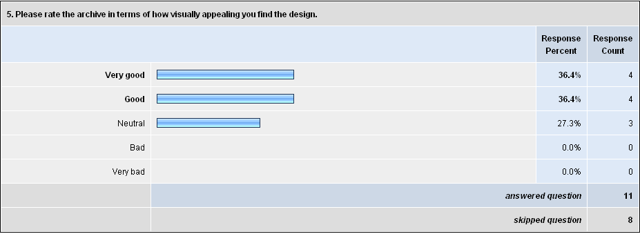
- Predictably there are a full range of responses to the overall aesthetic design of the site ranging from "the pastel colours are restful" to "the pale blue is slightly off putting". Some participants found there to be too much text while other suggested the explanations about the purpose of the archive were clear and concise
- From the interviews that were conducted face-to-face and some of the comments then another observation is that people tended to go straight to browse the archive rather than read any explanations. Also the teachers tended to go straight to the Education link. First impressions will thus be formed by this specific areas of the site.
- Generally I was surprised by how quickly people clicked around the site rather than read the text on the home page.
- Since the over all rating was good, then it can be assumed that first impressions are positive.
Searching for resources
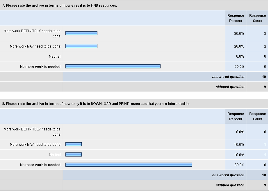
- generally download and print were no problem
- the was some evidence that people were not immediately noticing these 'buttons' on some screens
- some users were confused by the difference between the different types of archive search and the intute search
- without using advanced search it is difficult to retrieve just photographs with a search term
- generally browsing was a lot more popular than searching
- make the copyright statement for each resource easier to find - so that people know how a resource can be used immediately
Audio and Film collections
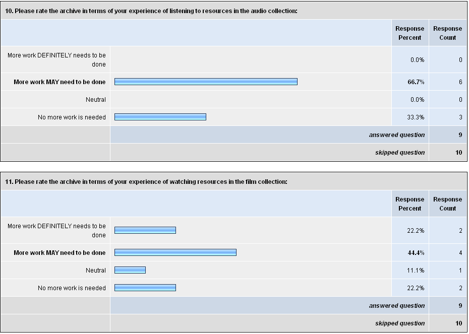
- this issues with this area of the site are essentially to do with technical support - the variation between computers, installed media players and browsers means that the overall experience of playing audio and video files varies dramatically.
- where people were successful in using audio and video resources they were very impressed - especially when hearing old fashioned voices talking about poetry.
- it is likely that school-level lessons could make good use of these resources if the technical barriers can be overcome
Exploring the educational resources
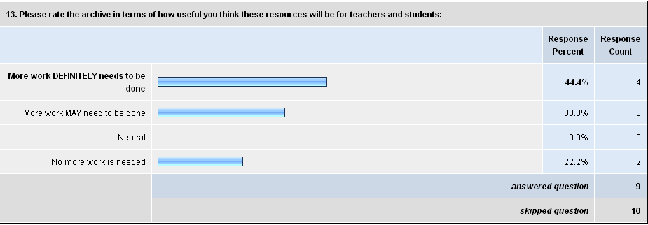
- the main issue here was that lecturers and teachers need to quickly understand the level that the resources are aimed at e.g. GCSE, A-Level, degree
- i do not know what to make of this comment but it seems relevant "that's not a resource, its just information" in reference to an external link to a predominantly text-based web page. I assume this refers back to the idea that for a resource to be useful to teachers a large amount of other information is needed to allow a teacher to feel confident that they could use it in a lesson or as homework
- teachers may also feel that they would need to copy and paste material from the site so that they can trim it down for their student - generally there may be too much text for school level education. there was the suggestion that the ww1 website could be like the bbc website by providing multiple views of the site, one simplified for teachers
- the ww1 archive needs to state very clearly what they are maintaining, and what is outside of the site e.g. lots of disclaimers about external resources especially the discussion and facebook
- might want to consider two ideas: (1) make education resources that are actually hosted on other sites (2) show how teachers can make learning resources that feature the archive
Favourites
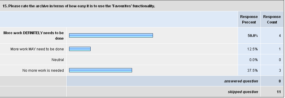
- The favourites icon is difficult to find
- It is easy to confused with browser based book-marking and the social book marking links
- The term favourites does not afford the functionality that lies behind this area of the site e.g. the compare tool.
- The compare tool is the 'killer app' for many users and needs promoting much more clearly
- When the favourites icon is in the pastel blue area of a web page e.g. near download and print it is very hard to find
Advanced search
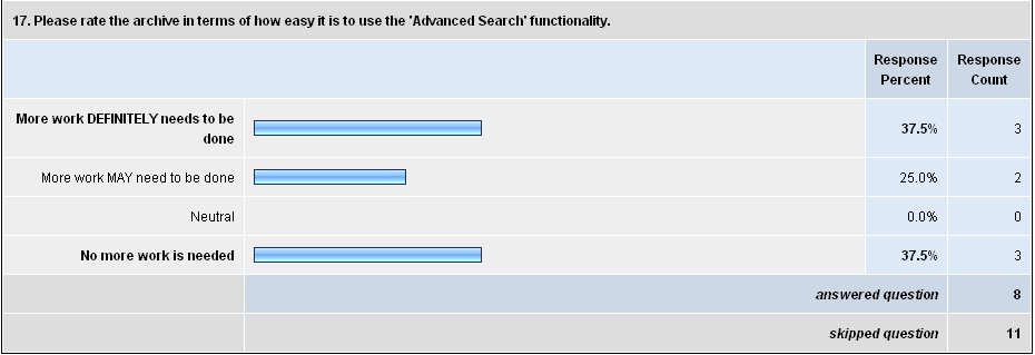
- The main problem with this area of the site is that there are two many terms that are difficult to disambiguate e.g. content type, content medium etc
- some configurations of the advanced search do not make sense e.g. object medium: find in the exact phrase: card. Anything that does not quite make sense will confuse users as to how to construct advanced searches.
- The calendar feature for dates is popular
Multi-page item
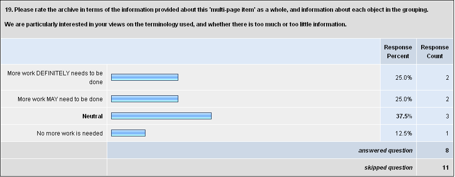
- The index box could be large to avoid excessive scrolling
- As in audio and video sections there was confusion about clicking icons to resources that they took the user to metadata rather than the resource e.g. confusion wrt icons and download 'button'
Overall evaluation
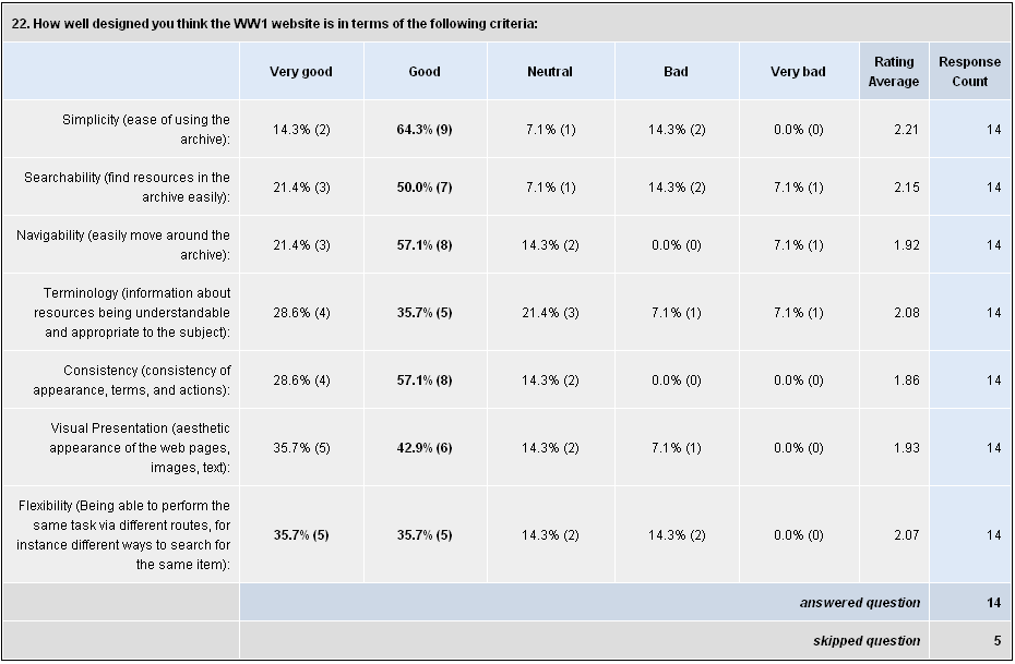
- Overall the evaluation scores are varied especially in the areas of searchability. Most users are adept at simple 'google-type' free text searches but find 'advanced search' more challenging. This issue is exacerbated by the specialist terminology used in the WW1 Poetry Archive.
- Interestingly two users said that the archive was very flexible but this makes it less usable - too many ways to approach a task can result in a worse experience in terms of usabililty.
Finally
- School teachers need to decide very quickly if a resource can be used in their work. To tailor the site to school lessons it needs to become more succint in terms of textual descriptions. Also the site needs to become 'safer' in terms of including links to external resources, especially facebook and google groups.
- The site is making 'advanced' internet resources available which bring a wide range of interoperability issue with it. The site should cover itself by explaining up front where these problems may arise, so prevent people thinking that the archive has been designed badly. Between clicking a link to an audio and playing the file there can be a large number of steps, all of which could result in a failure to play the recording.
- Despite the archive being rated badly in some areas the overall evaluation was positive, there seemed to be consensus that the existing issues are small, and when fixed the archive will be a very valuable resource. Evidence for this came when during the face-to-face interviews participants were asked how they could use the archive - this question resulted in enthusiastic and creative ideas. All three teachers said they would be willing to support future development and to use the archive in their teaching. Most of the lesson ideas focused on comparing texts, and asking students to annotate poems using an interactive whiteboard.
Analysis
The analysis is presented in a form that makes it as clear as possible which aspects of the system need further development. The table below can be used by the development team to begin to work out how much effort is needed to undertake each requirement. The team as a whole can then decide which tasks to prioritise for implementation before the June steering committee meeting.
Phase 1: May 2008
- Importance (i): not important=1...5=essential
- Effort (e): easy=1...5=very difficult
Id |
Requirement |
Importance (i) |
Effort (e) |
Score (i x e) |
Notes |
Planned action |
1 |
Change website banner. |
2 |
|
|
|
|
2 |
General website emphasis |
3 |
|
|
|
|
3 |
Move search box |
5 |
|
|
|
|
4 |
Standardise download tool |
5 |
|
|
|
|
5 |
Provide more options for download |
1 |
|
|
M.L Do not think that this is necessary and might include additional costs for royalties to Adobe |
|
6 |
Standardise printing tool |
2 |
|
|
M.L What is shown on the screen after the PRINT link is clicked is what is printed. I believe that what is needed here is that we display the print preview so that the whole page is shown on the screen as a full page-to-be-printed preview. |
|
7 |
Adding items to favourites over multiple pages |
3 |
|
|
M.L or if not possible for technical reasons then at least prompt the user to add selections to favorites before moving to the next page |
|
8 |
Drag and drop in favourites |
1 |
|
|
M.L This will cause more accessibility problems than it's worth |
|
9 |
Make clearer what move tool is for |
3 |
1 |
|
Help text |
|
10 |
Bug fix: adding duplicate items to favourites |
4 |
|
|
M.L I agree with Howard that here we should warn the user that an item has already been added BUT allow the rest to be added at the same time. |
|
11 |
Improve advanced search |
4 |
|
|
|
|
12 |
Improve metadata |
3 |
|
|
|
|
13 |
Date range format |
2 |
|
|
|
|
14 |
Emphasize compare tool |
4 |
|
|
|
|
15 |
Viewing metadata |
3 |
|
|
|
|
16 |
Metadata hyperlinks |
2 |
|
|
M.L Should not remove. This is useful but we must limit it to specific fields and also give instructions to the user about this functionality |
|
17 |
Website glossary |
2 |
|
|
|
|
18 |
'Name of cataloguer' |
1 |
|
|
|
|
19 |
Broken URLs in metadata |
2 |
|
|
|
|
20 |
Make it easy to compare images from different parts of the site |
4 |
|
|
M.L This will cause more accessibility problems than it's worth |
|
21 |
Remove buttons that have no relevance to a specific screen |
1 |
|
|
|
|
Phase 2: September 2008
- Importance (i): not important = 1...5 = essential
- Effort (e): easy=1...5=very difficult
Id |
Requirement |
i |
e |
ixe |
Notes |
Planned action |
1 |
BUG: Fix the overflowing text on this page: http://ww1lit.rwdit.net/education/bibliography.html This happens on a range of browsers and operating systems. |
3 |
1 |
3 |
|
|
2 |
BUG: On 14 inch laptop using IE 6 on Windows XP the "tag boxes" e.g. in "browse by keyword" in collections were aligned in a single row causing massive horizontal scrolling rather than a well formatted grid |
4 |
1 |
4 |
|
|
3 |
Provide help/ support for people wanting to play audio and video resources - there are an enourmous range of technical issues that arise on the plethora of different operating systems e.g. which media player is available/ codecs available etc |
3 |
2 |
6 |
this is not a problem specific to the site. this issue can be addresses by providing some simple help that points off to some external support web pages. |
|
4 |
Part of the image is not viewable, is cut off, when printing rectangular images. |
|
|
|
|
|
5 |
Reduce the amount of text on the site by using introductory paragraph + a "read more" link |
3 |
3 |
6 |
this will also help bring links to things like the collections within the field of view without having to scroll down |
|
6 |
Add disclaimers below external links within the ww1 archive website e.g. the google groups community links |
5 |
1 |
5 |
one of the google groups currently has a large amount of 'undesirable' material which should not be associated with the ww1 website |
|
7 |
Crop some images so that compare function is easier to use |
3 |
3 |
9 |
some images when brought into the compare screen show just white space and require the user to scroll down a long way to find the picture. users did not realise this |
|
8 |
Be more explicit on the home page how resources can be used e.g. addded to books?/ put in slides etc. Perhaps add to this sentence on the home page "Freely available to the public as well as the educational community, the First World War Poetry Digital Archive is a significant resource for studying the First World War and the literature it inspired." |
3 |
1 |
3 |
this is a small thing to help it be more obvious how different types of user can activity engage with the archive as part of their work |
|
9 |
Support text to help users disambiguate advanced search terms e.g. object type, object medium etc |
3 |
1 |
3 |
through help pages and examples on the advanced search page itself |
|
10 |
Make the favourites icon easier to find on all screens |
5 |
1 |
5 |
just use something with brighter colour e.g. a star |
|
11 |
Highlight the favourites functionality much more - it is the killer app for the site |
5 |
3 |
15 |
should it be moved up the screen - remember it won't even be visible without scrolling on most laptops |
|
12 |
Make the "choose words from a list" the default in advanced search |
1 |
3 |
3 |
this will help people understand the search terms |
|
13 |
Move the search box to the top of all screen |
2 |
5 |
10 |
on the same lines of thinking as favourites, this is an important aspect of the archive yet seems hidden. a larger box on the top right would seem to be more in-line with other sites. |
|
14 |
Increase the contrast between the page background and functional buttons |
3 |
3 |
9 |
|
|
Acknowledgements
This study was conducted by Howard Noble and Michael Loizou at Oxford University. We'd like to express our gratitude to all the teachers and lecturers who helped improve our understanding of how to design the WW1 Poetry Archive: http://www.oucs.ox.ac.uk/ww1lit/ .